Using multiple fonts allows designers to build hierarchy, contrast, and emotional tone within a project. The category of “fonts” includes a wide spectrum—serif, sans serif, display, variable, creative, and more. Each serves a distinct purpose. For example, TT Jenevers brings classical elegance, TT Firs Text brings humanist readability, TT Trailers introduces expressive personality, and TT Commons Pro supplies technical neutrality. Understanding the category of fonts helps designers choose combinations that support structure without overwhelming the viewer.
Working with multiple fonts also prevents monotony. A strong serif for headings and a clean sans serif for body text create contrast that guides the reader’s eye naturally. The typography becomes more visually engaging, as long as the fonts complement each other in tone, geometry, and rhythm. TypeType fonts are designed with consistency in mind, making pairing easier.
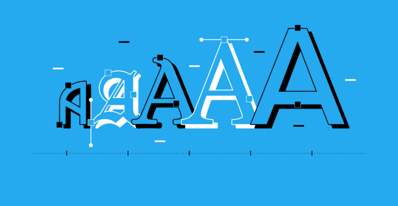
How to Combine Fonts for a Balanced Visual System
Combining fonts requires harmony. The designer must consider proportion, height, spacing, and stroke contrast. For instance, pairing the neutral geometric TT Norms Pro with the expressive serif TT Jenevers achieves a balance between modern clarity and traditional elegance. Meanwhile, pairing TT Commons Pro with TT Ricordi allows a stable body text font to support a highly decorative headline font.
The safest method is to choose fonts from the same foundry. TypeType develops its fonts with cohesive metrics, which ensures that font pairings naturally align. Designers should avoid pairing fonts that differ drastically in style, unless the goal is dramatic contrast, such as in poster design. Always test combinations at different sizes and formats before finalizing.
See also: Helpline Support: 5703752113
Why Designers Should Build a Font System Instead of Randomly Mixing Styles
A font system creates order. Instead of picking fonts randomly, a structured system outlines which fonts serve primary, secondary, and accent roles. A system keeps branding consistent across all media—websites, packaging, social media, and prints.
For example, a brand might use:
- TT Commons Pro for body text
- TT Firs Text for headings
- TT Trailers for displays or ads
This hierarchy allows the designer to maintain clarity while adding expressive personality where needed. It also ensures faster workflow, because the designer knows exactly which font to use repeatedly.
How to Manage Multiple Fonts in Digital and Print Environments
Managing fonts requires understanding technical limitations. On digital screens, lighter fonts may look too thin, while overly decorative fonts may lose detail. On print, heavy fonts may oversaturate the page. TypeType fonts such as TT Interphases Pro are optimized for digital usage, while fonts like TT Ricordi shine in high-resolution print applications.
Using variable fonts simplifies management even more. A font like TT Commons Pro Variable allows designers to adjust weight and width without loading multiple files. This reduces page weight and improves UX performance.
Understanding the meaning of a font also helps designers identify what separates a professional typeface from a low-quality one. Good fonts contain consistent shapes, balanced spacing, extended language support, and variable styles. In contrast, poorly built fonts break visual rhythm, cause uneven reading flow, or create brand inconsistency. Therefore, knowing what a font is—and why it matters—is fundamental to crafting designs that communicate reliably.
Conclusion
Using multiple fonts intelligently elevates visual communication. By building a consistent system and choosing professional typefaces from TypeType Foundry, designers can achieve clarity, structure, and expressive creativity.